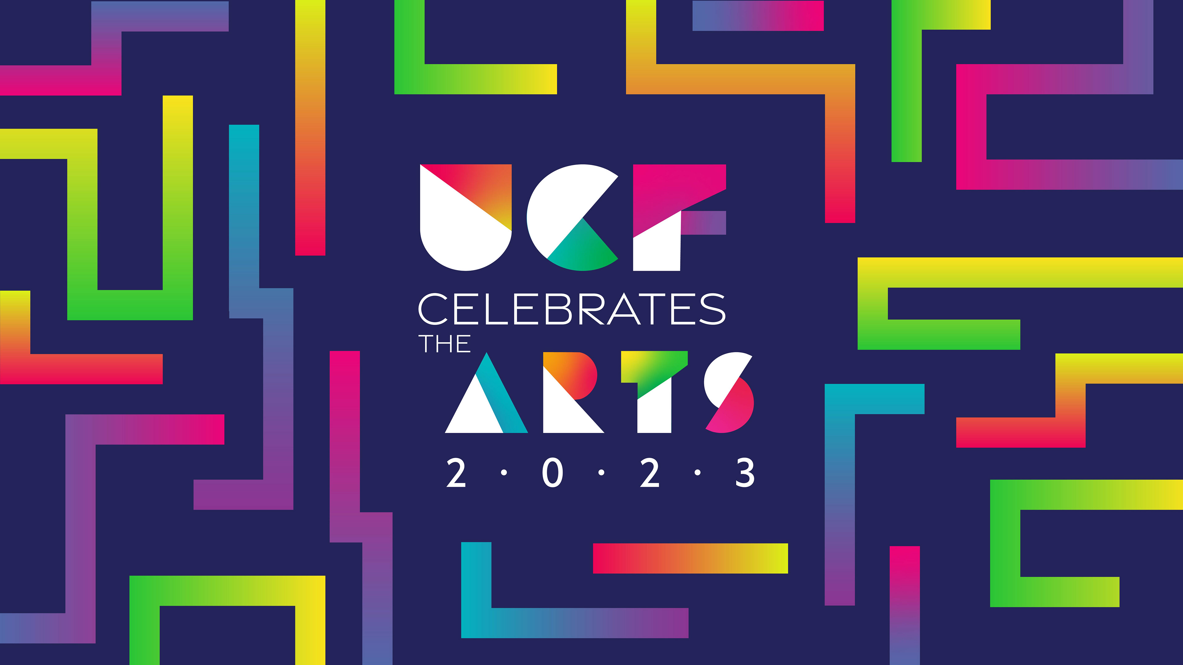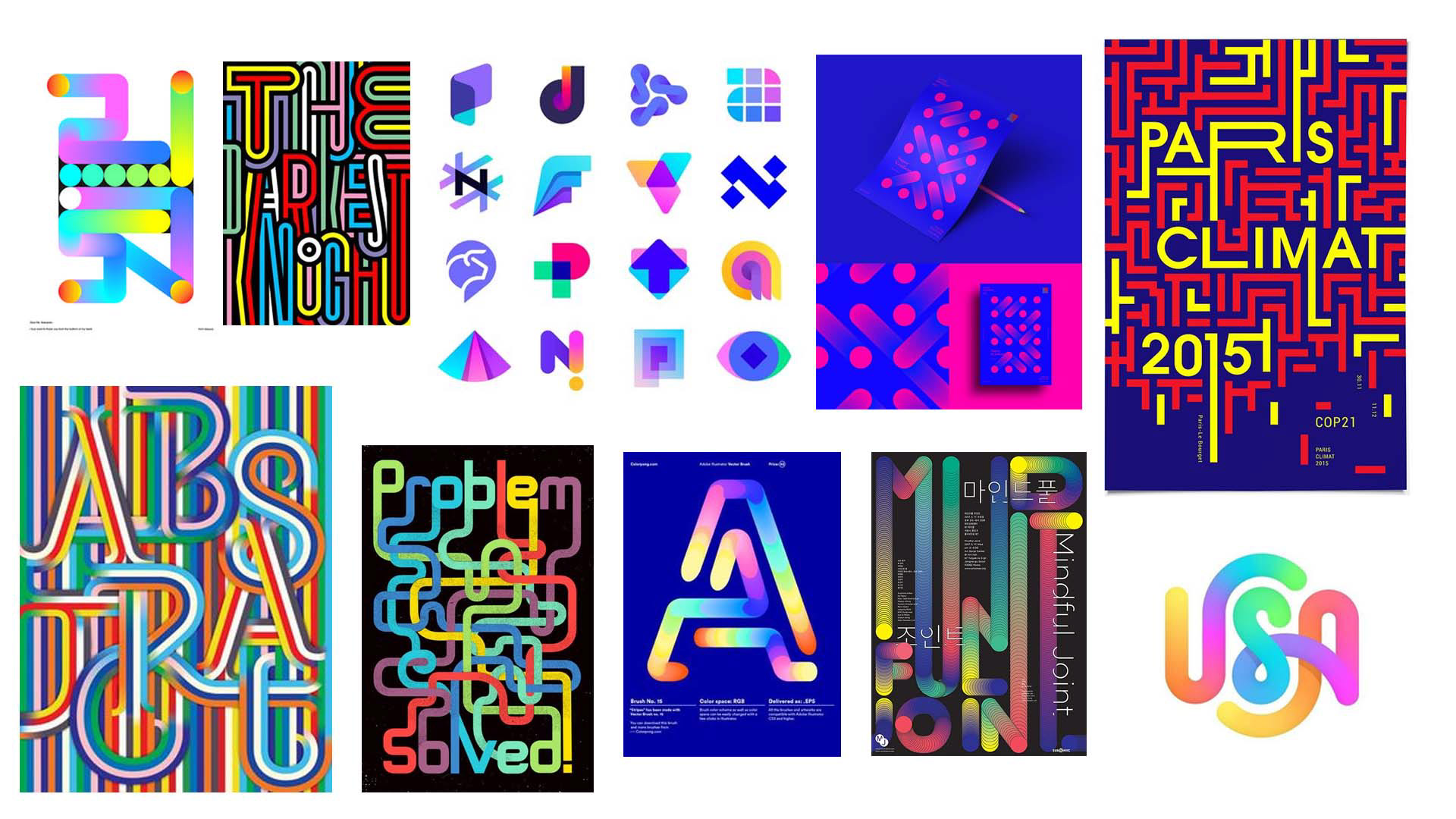
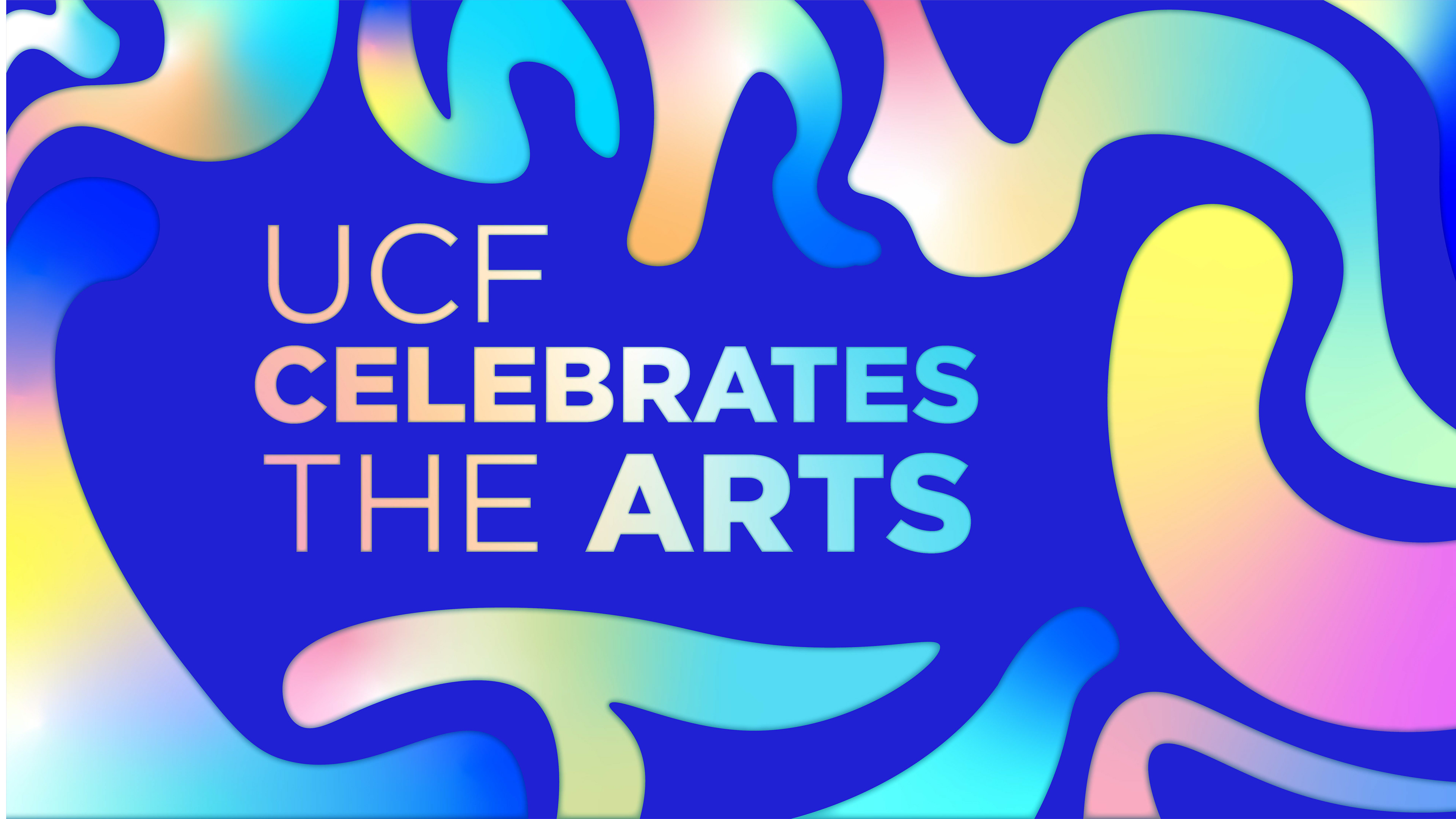
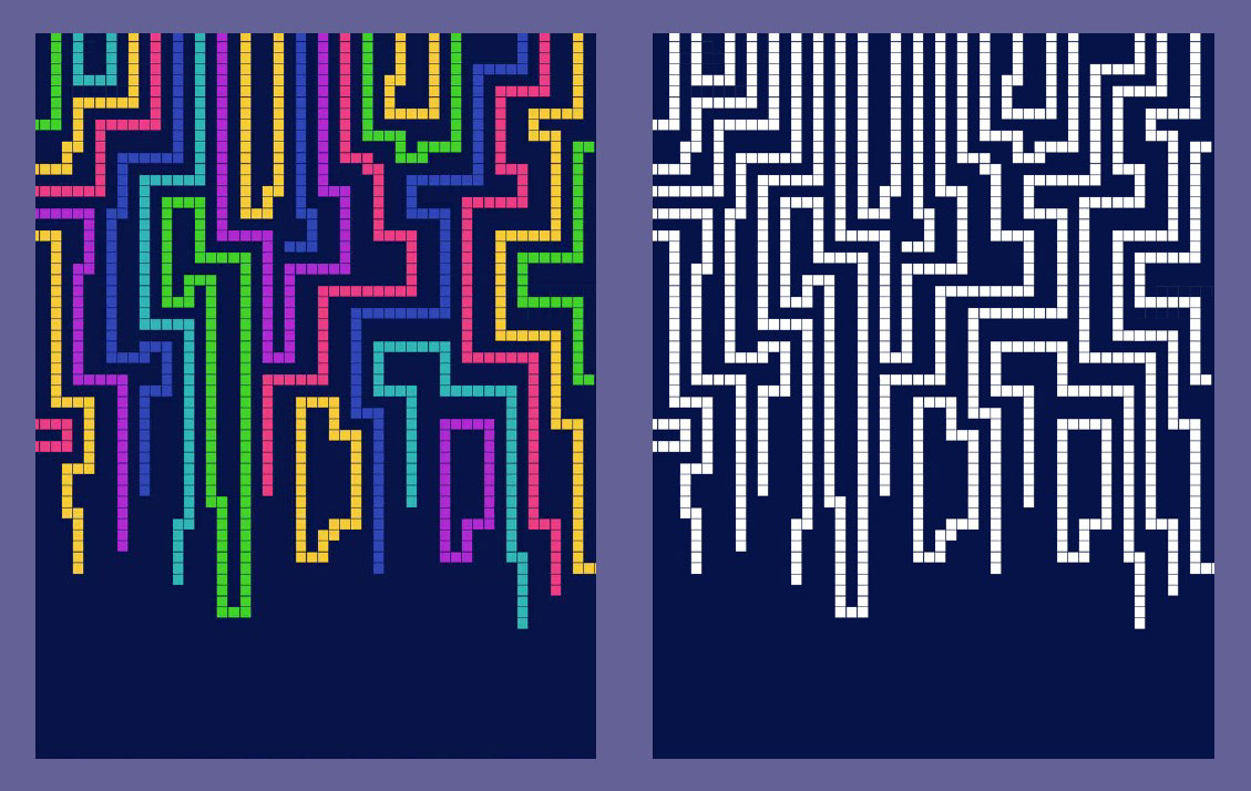
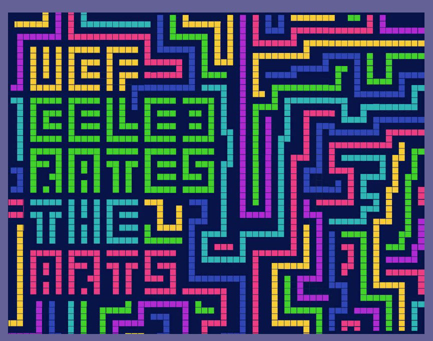
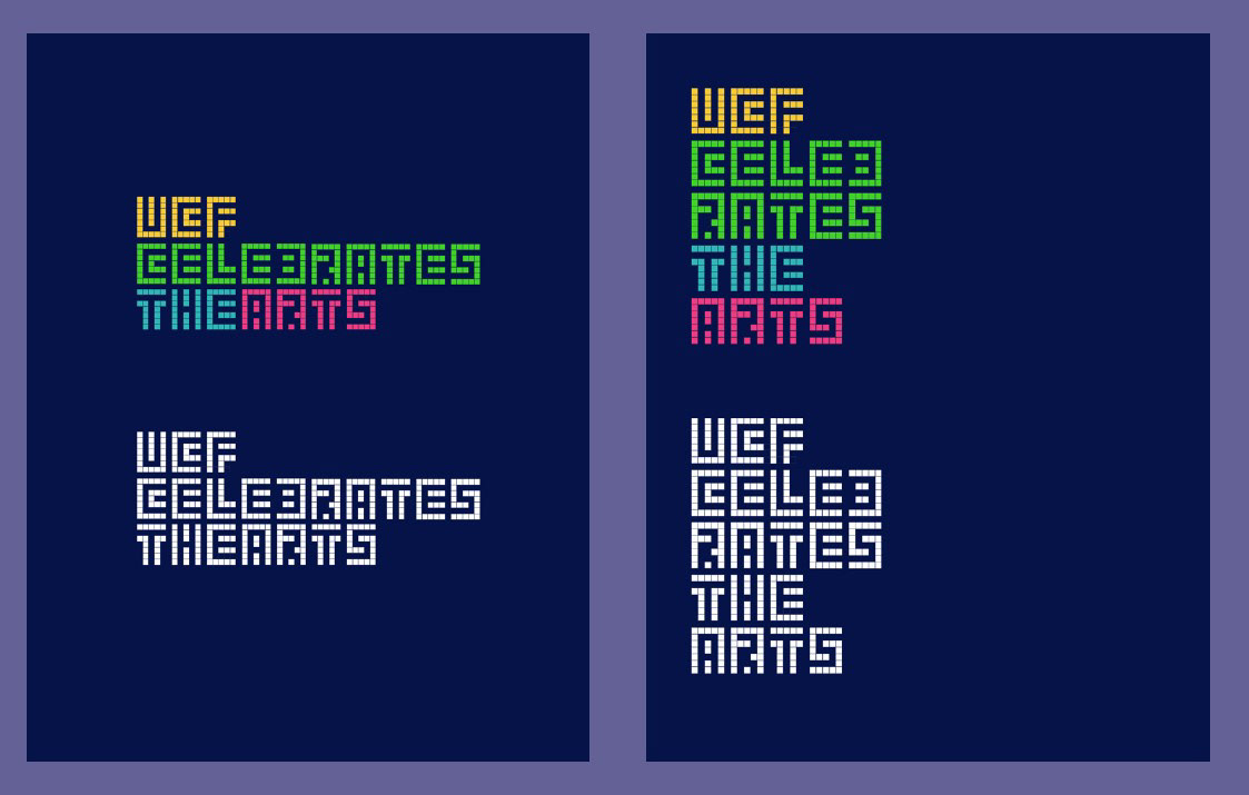
After some feedback, a navy blue background was chosen. The line texture was well received, but the client wanted to see other variants of the line. Because of this, I went with a pixel art aesthetic and created an intricate pattern of lines dripping from the canvas. The wordmark would follow the same grid as the pattern to create a complex design.
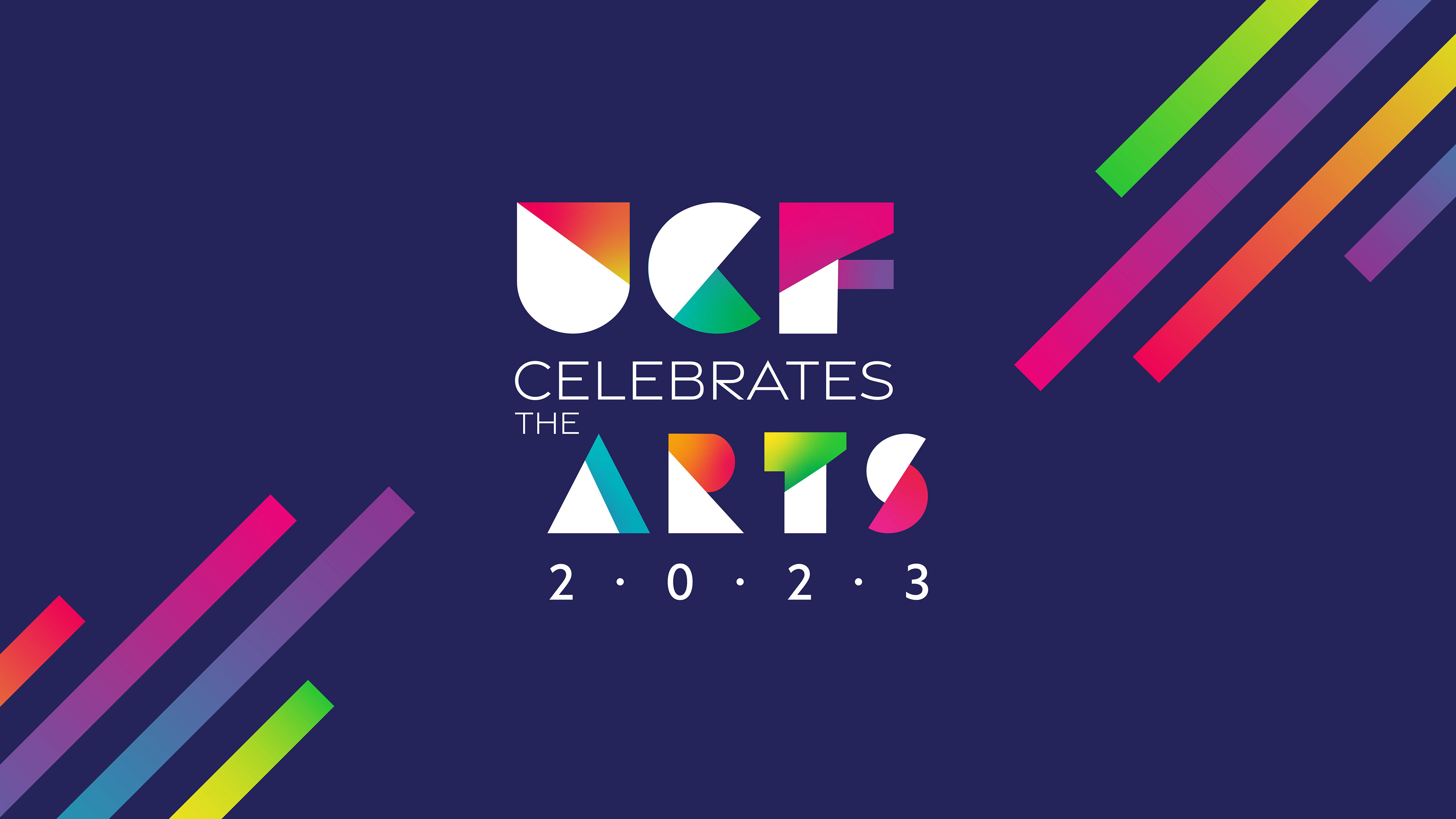
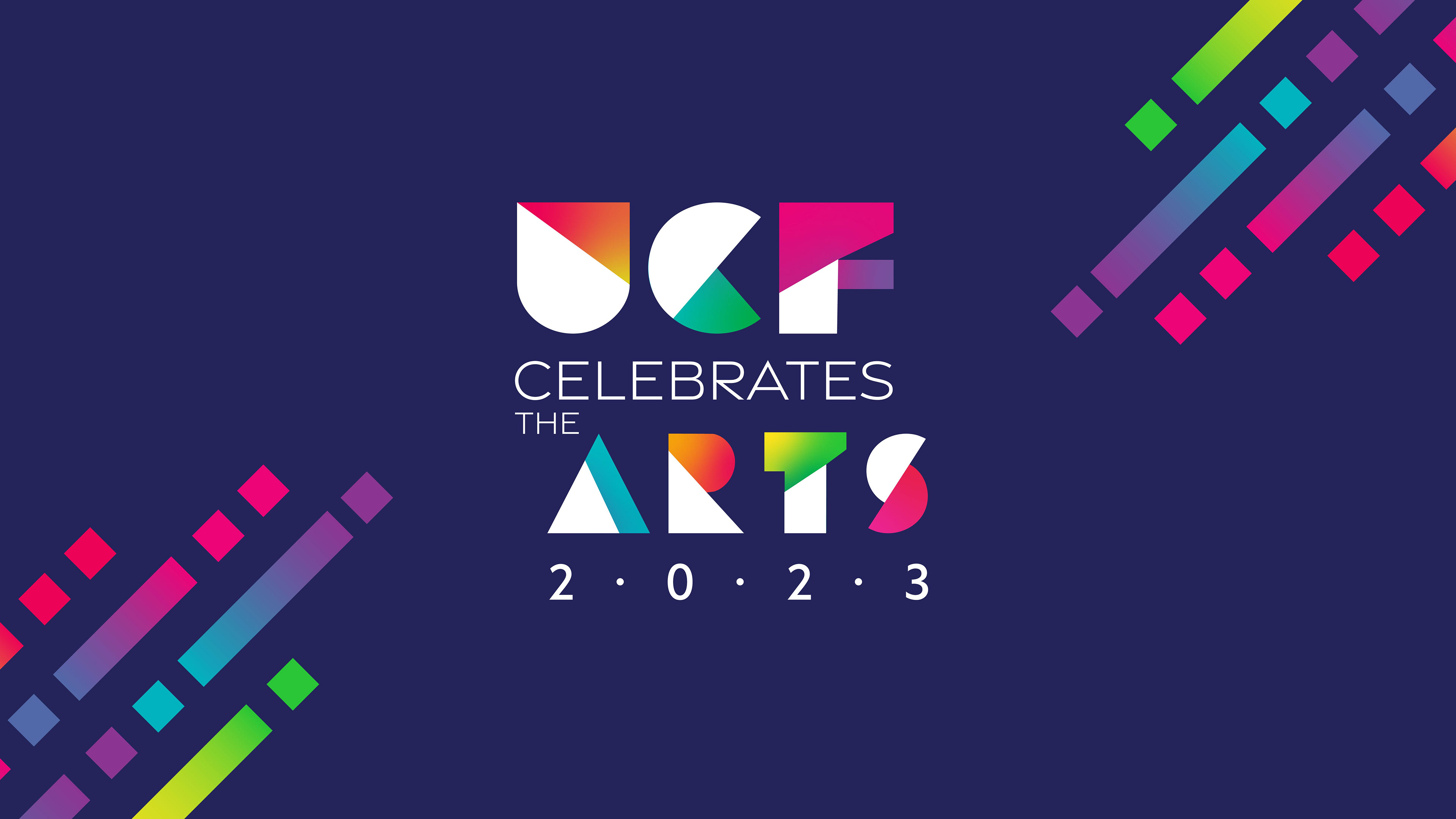
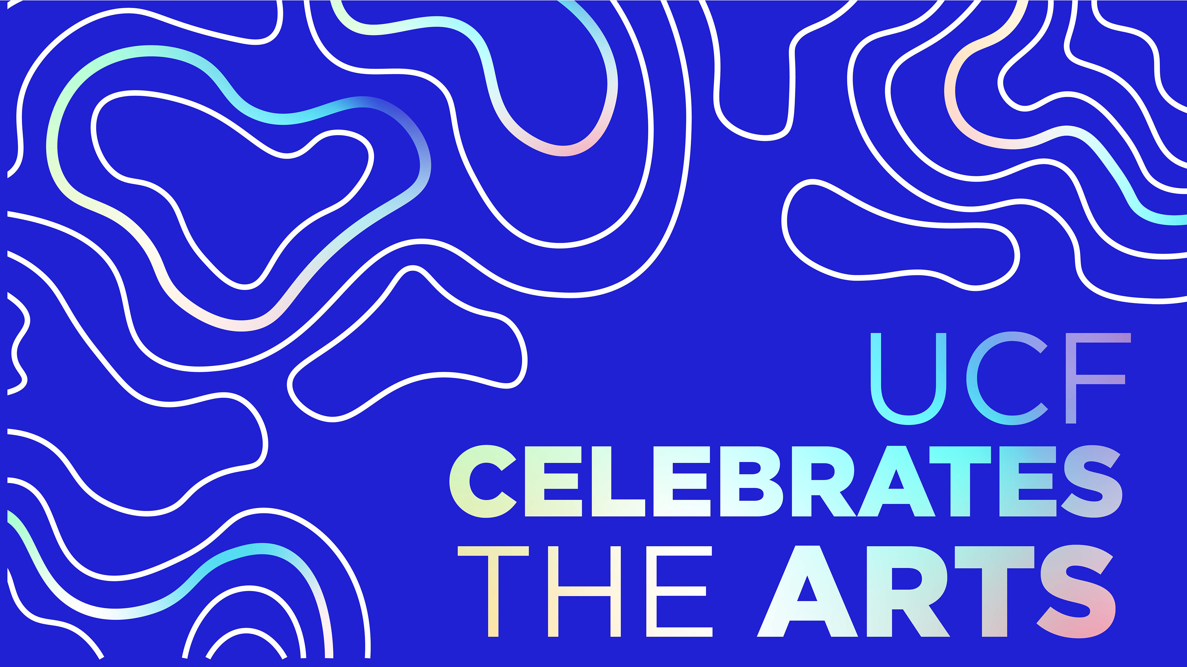
The client was intrigued by the lines but wanted them to be solid. I adjusted the lines accordingly, however, added varied gradients to give the lines more energy than just the flat colors. My peer, Arianna O'Rourke designed the wordmark that complimented the pattern. The ideas would be refined and used as the official UCF Celebrates the Arts Brand.